The Toronto Transit Commission's new Web site is in beta test, which means it's not in production but we can visit it and the TTC wants our feedback to finalize the design. You'll be doing yourself and myriads of TTC users a favour.
The Toronto Star reports that the TTC's new home page is still a work in progress:
—Tess Kalinowski, Transportation Reporter
Now there's a better way to navigate the TTC online but the transit agency isn't home yet when it comes to its new website. The TTC previewed its long-awaited homepage today to replace the version it's been running since 1998. With new easy-to-read graphics and search engines for bus and streetcar routes, it nevertheless doesn't yet have a trip planning tool or up-to-the-minute service updates for the system. Those features, along with an e-commerce function, will be added by next year, said the TTC's marketing manager Alice Smith. Eventually the TTC's site will function like the Chicago transit system's where users can actually watch the buses and see delays, said commission chair Adam Giambrone.
A quick look at the old site
This is the TTC's old home page. It's quite long. Notice the link at the top to the new site.
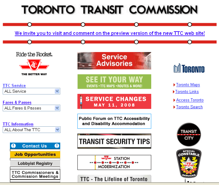

The badges in the old page are links to sub-pages. Those might be in the TTC's own Web site. This is the result of clicking "TTC Service:"

Or they might go to a page in the extensive City of Toronto Web site:

The new site
The new site has an introduction. It uses a lot of abstract nouns and needs a plain-language rewrite.
Then you click "Continue" to get to the new home page:

This new web page is quite wide, about 960 pixels. People with older monitors might not realize that there's a far right-hand column with more choices unless they have horizontal scrolling turned on and they look at the horizontal scroll bar.
The new site looks pretty. It uses the streetcars' colours of red, black, and white. But close your eyes half-way and squint at the screen. You'll see that the heavy black bar across the top is the strongest visual element. It pulls your eye away from the more important text below.
Because of the strong horizontal elements, It took me a while to realize that the menus should be read vertically from the heading above the line.
 Four topic areas are headed by a red line faintly divided by grey bars, and with a dot like a station on a route map. To me, the dot separated the menus from their title rather than connecting them.
The site is divided logically into four main topic areas
- Schedules & Maps
- Fares & Passes
- Riding the TTC
- Service Alerts
This is the Schedules & Maps area.
It was not obvious to me that the three symbols along the top stand for the three kinds of routes. Perhaps the symbols could be placed vertically with their descriptions beside them. Also, there's lots of room to write "Rapid Transit" or "Rail Transit" instead of the cryptic "RT." When in doubt, spell it out.
There's a place-holder for a link to the future trip planner. I hope that it will allow you to say when you want to arrive will tell you when you have to leave, instead of just asking you when you want to leave. Or perhaps it will even ask you which kind of planning to use.
To get to a schedule, click in one of Subways, Buses, or Streetcars. If you know your route number, such as 501C, you can type it instead of searching through the schedule menus.
I chose Streetcar Routes. You go to a second-level menu of major routes.

Select a route. (I chose 501 Queen.) The white-on-black text at the top of the route tells you that this is for eastbound streetcars. Many people can't read reverse video easily and will read "Westbound" more clearly than "Eastbound."
The schedules have the very nice feature of showing the next vehicle scheduled to go by in each direction. (In future, you may see real-time results.) The next scheduled arrivals appear at main intersections for active routes.

If you select a sub-route, you get a more detailed schedule:

Unlike the Streetcars menu, the Service Alerts menu is scattered over the page:

The Service Alerts menu makes your eye rove around to see all the choices. This seems like an attempt to use up all that horizontal white space. There's nothing wrong with the old, vertical format:

If drill down a level in the new Web site, you'll find that warnings such as Construction Projects are unfinished.

Until the Web pages are are complete, I think that they should link to the updates on the City of Toronto site, as the old Web site does.

The Star is correct: it's a work in progress. Take time to visit the new site and leave your feedback. We can help the TTC to improve their user experience if we act now.
First, go and roam around the TTC beta site. Then return to its home page. At the bottom is a link to a survey. Follow the link and fill out the survey.